I answered this question in the form of a Youtube video which can be viewed below:
Tuesday, 1 April 2014
Question 1
In what ways does your media product use, develop or challenge the forms and conventions of real media products?
I answered this question in the form of a Youtube video which can be viewed below:
I answered this question in the form of a Youtube video which can be viewed below:
Thursday, 20 March 2014
Question 2
How does your media product represent particular social groups?
I made this mindmap on MindView 3.0, below is a screenshot of my map and I will zoom in on the sections so they are legible.


I made this mindmap on MindView 3.0, below is a screenshot of my map and I will zoom in on the sections so they are legible.
Thursday, 13 February 2014
Question 3
What kind of media institution would distribute your magazine and why?
I did this question in Powerpoint format and then screenshotted each slide to place on my blog, I have the original powerpoint saved.


Question 5
How did you attract/address your audience?
I addressed my audience mainly through my focus group, but also talking to my friends and family who were also part of my target audience and just casually discussing the topic of the magazine and seeing their responses.
 On my front cover, I presented my fictional duo, CD, as upcoming artists. During our focus group, this is what everyone was keen to see, so I made sure to this when I created my magazine.
 These are the colours that people felt that suited an R&B magazine, and the colours they expected to see on one. I used gold throughout my magazine in response to this.
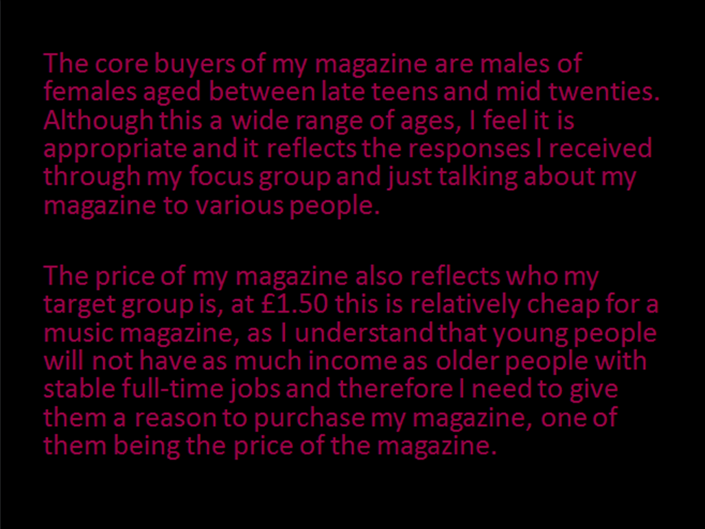
 I made the price of the magazine £1.50 even though the people I asked said max. £1.20, this is because further on they said "it would actually depend upon a variety of factors" such as free gifts. Following this, I included a promise of free Itunes downloads and also discount codes, for clothing and game sites. I didn't want to increase the price of the magazine too drastically, but I felt 30p was an adequate and fair price to increase too, given the freebies and discounts I had added.
 My focus group, also said that interviews on the double page spread were very important, so I took this into consideration and did an interview.
 The group were confident on the idea that there should only be one main image, so as to not create clutter. They also stated this image should be of the artist featuring in the magazine. When creating my magazine, I reflected their opinions by only including one image of the duo CD, who also had a main feature in the form of an interview.
In conclude, to attract my audience, I incorporated the various things they asked for/ expected to see on a typical R&B magazine. The people in my focus group, were people who would be in my target market, so the feedback they gave me was relevant and I took on board a lot of it and used it when creating my magazine.
I addressed my audience mainly through my focus group, but also talking to my friends and family who were also part of my target audience and just casually discussing the topic of the magazine and seeing their responses.
In conclude, to attract my audience, I incorporated the various things they asked for/ expected to see on a typical R&B magazine. The people in my focus group, were people who would be in my target market, so the feedback they gave me was relevant and I took on board a lot of it and used it when creating my magazine.
Question 6
What have you learnt form technologies from the process of constructing this product?
My response to this question, is in the form of a Prezi. The link is below:
chttp://prezi.com/drpp8royaq0e/what-have-you-learnt-from-technologies-from-the-process-of-c/
My response to this question, is in the form of a Prezi. The link is below:
chttp://prezi.com/drpp8royaq0e/what-have-you-learnt-from-technologies-from-the-process-of-c/
Wednesday, 12 February 2014
Question 7
Looking back at your preliminary task, what have you learned from it in the progression to the final product?

On the left is my school magazine front cover for my prelim. task and on the right is my finished music magazine front cover. To start with, I learned how to flatten images onto layers and the importance of doing this. On the prelim. front cover, I didn't flatten the masthead to the main layer so it appears raised and not completely part of the magazine. Also flattening the image, reduces the chances of someone opening my work and changing it so it keeps it safe. I flattened the masthead on the music magazine and you can see it looks better.
When making the music magazine I also found the importance of using high quality images. For the prelim magazine, I used the camera on my phone which didn't provide as good quality photos as the DSLR I used for the music magazine. When editing on Photoshop, I couldn't manipulate the prelim. magazine image as much as the music magazine, because it would lose quality and the image would be blurry.
I also learnt how the use of different colours and the arrangement of the colours and texts on the page affected the overall look of the magazine. On the prelim. magazine, the text is harder to read, for example the masthead is in red which clashes with the image as a lot of books are also red. The image I chose for the cover also meant I had to reorganize the text, because it was very difficult to read against the image. On the music magazine however, I figured I could change the colour of the text to black or white where it would be difficult to read and chose an image that allowed me enough space to add text wherever I wanted.
On my music magazine I also learnt that adding features such as a bar code and QR code make the magazine resemble an actual magazine.

By completing my prelim. task I also found out the quick keys to performing certain tasks which made the construction of my main task a lot easier and quicker. For example, I now know I can use Command+t to free transform an image, as opposed to going to the Edit tab and scrolling down to find it.

By the time I produced my main task, I had now researched more magazines so I was aware of the conventions of contents page. Using this knowledge I was able to make my music magazine appear much more professional. When I was constructing the contents page I had limited understanding of Photoshop, so I did not manipulate the image much, aside from just choosing pre-selected effects. However, when doing my contents page for the music magazine, I could now with ease, do more complicated image manipulation such as using the marquee tool to select specific sections and darken them as opposed to the entire image, this is what I did to darken the image of my model to create an almost silhouette.

Although I didn't create a contents page for my DPS, I was able to apply the skills I had learned from my prelim. task to create it. Again, I understood the importance of little details, such as page numbers and how they helped to make the magazine look like a real copy.
To conclude, I feel my prelim. finished product was awful and very tacky. However, I feel this enabled me to develop my skills and show a degree of progression to my main task. Had my prelim. magazine been very good, it would have been difficult for me to comment and there would be little space to show improvement. At first, I saw the prelim. task as a waste of time, but now I see it was very important and had I not completed it, I feel my main task would have looked a lot worse.
On the left is my school magazine front cover for my prelim. task and on the right is my finished music magazine front cover. To start with, I learned how to flatten images onto layers and the importance of doing this. On the prelim. front cover, I didn't flatten the masthead to the main layer so it appears raised and not completely part of the magazine. Also flattening the image, reduces the chances of someone opening my work and changing it so it keeps it safe. I flattened the masthead on the music magazine and you can see it looks better.
When making the music magazine I also found the importance of using high quality images. For the prelim magazine, I used the camera on my phone which didn't provide as good quality photos as the DSLR I used for the music magazine. When editing on Photoshop, I couldn't manipulate the prelim. magazine image as much as the music magazine, because it would lose quality and the image would be blurry.
I also learnt how the use of different colours and the arrangement of the colours and texts on the page affected the overall look of the magazine. On the prelim. magazine, the text is harder to read, for example the masthead is in red which clashes with the image as a lot of books are also red. The image I chose for the cover also meant I had to reorganize the text, because it was very difficult to read against the image. On the music magazine however, I figured I could change the colour of the text to black or white where it would be difficult to read and chose an image that allowed me enough space to add text wherever I wanted.
On my music magazine I also learnt that adding features such as a bar code and QR code make the magazine resemble an actual magazine.
By completing my prelim. task I also found out the quick keys to performing certain tasks which made the construction of my main task a lot easier and quicker. For example, I now know I can use Command+t to free transform an image, as opposed to going to the Edit tab and scrolling down to find it.
By the time I produced my main task, I had now researched more magazines so I was aware of the conventions of contents page. Using this knowledge I was able to make my music magazine appear much more professional. When I was constructing the contents page I had limited understanding of Photoshop, so I did not manipulate the image much, aside from just choosing pre-selected effects. However, when doing my contents page for the music magazine, I could now with ease, do more complicated image manipulation such as using the marquee tool to select specific sections and darken them as opposed to the entire image, this is what I did to darken the image of my model to create an almost silhouette.
Although I didn't create a contents page for my DPS, I was able to apply the skills I had learned from my prelim. task to create it. Again, I understood the importance of little details, such as page numbers and how they helped to make the magazine look like a real copy.
To conclude, I feel my prelim. finished product was awful and very tacky. However, I feel this enabled me to develop my skills and show a degree of progression to my main task. Had my prelim. magazine been very good, it would have been difficult for me to comment and there would be little space to show improvement. At first, I saw the prelim. task as a waste of time, but now I see it was very important and had I not completed it, I feel my main task would have looked a lot worse.
Subscribe to:
Comments (Atom)