Monday 30 September 2013

Women's Health Magazine Analysis


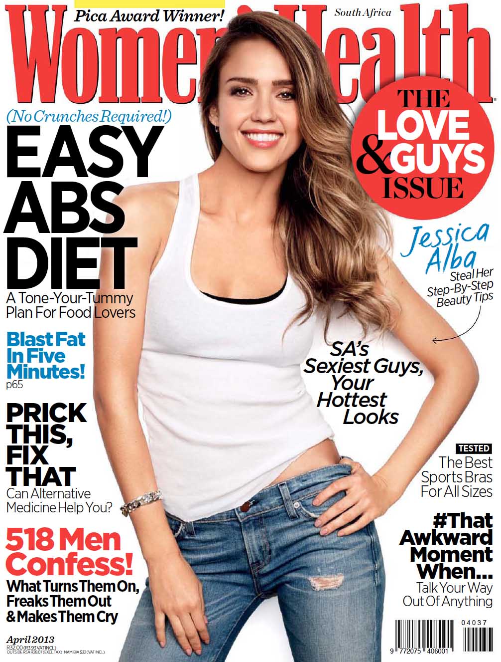
The title is called "Women's Health" therefore it's obvious target audience is women looking for health and lifestyle tips. Red is the prominent colour, and is well known as a seductive, sexy colour, implicating that women who read and apply the tips to their lives will become sexier and look better to themselves and others. 

The font used is big, bold and formal, it looks professional, which in turn reassures the reader that it's content is legit and trustworthy. Women's Health is such a renowned magazine that although the title is partially covered, it's target audience would still know what magazine it was if they saw it on the shelf.

Use of a white background, suggests simplicity which could refer to the header that boasts a "No Crunches Required! EASY ABS DIET" a opposed to a cluttered or colourful background, the plain white adds a fresh, easy going feel to the magazine. 

Featured on the front cover is Jessica Alba, dressed in a casual outfit as opposed to an expensive designer dress, this projects the idea of her being a "normal" woman, making her more relatable to the average women who will buy the magazine. She has a slim figure, which in media is pushed as the "perfect female body" and the magazine uses this in order for women to feel encouraged to buy the magazine in order to also achieve her figure. Like Nicki Minaj in the previous post, we see Jessica Alba stood in the same hands-on-hips stance, this suggests "girl power" and confidence. Her warm smile, is also friendly and inviting which subliminally entices ladies to purchase the magazine.

A hashtag "#thatawkwardmomentwhen"  is also present, allowing readers to get socially involved through Twitter. A potential buyer, may search the tag to see what people are talking about online, if it sounds interesting, this may encourage them to purchase the magazine and also join in the online conversation.

The front cover is jam packed with snappy headers that the target audience want to see on a health and fitness magazines, for example "Blast Fat in Five Minutes!" jumps out to women, who are constantly searching for new weight loss routines, they will be intrigued to learn this secret and see what else the magazine has to offer.

Repetitive use of the word "your" allows the reader to feel as though the magazine was made for them, which makes them want to read even more. 


Friday 27 September 2013

Teen VOGUE Magazine Analysis


The title of the magazine is "Teen VOGUE" a clear implication that the magazines main target audience are teenagers, specifically girls. The content of the main VOUGE magazine is fashion and beauty, so the Teen VOUGE magazine is aimed at teenagers looking for inspiration for styles and looks aimed at them. 

The juxtaposition of the two fonts used in the masthead, shows the combining of the sophisticated content found in the main VOGUE magazine, with the fun, young and fresh content featured in Teen Vogue, expressed by the playful, bold font used for the word "teen".

Pink and baby blue are the main colours on the page. Pink is universally stereotyped as a girl's colour, therefore the magazines choice to use it as the prominent colour, reinforces the fact that it is intended for girls. Baby blue is also considered a girl's colour, or a colour associated with baby boys. As many females have a soft spot for babies, this is a good way in which the magazine draws in it's female audience. The background is a soft pastel blend of these two colours with areas of lilac where the two colours meet. Overall this adds to the effect of creating a very girly, almost "airy fairy" feeling.

Nicki Minaj is this issues famous celebrity model, well known for her music and outlandish fashion sense, she is a good candidate for a fashion magazine representative. She has a wide smile, which from a distance is eye catching. A smile is also a gesture used worldwide and conveys openness and friendliness, so the smiling Nicki encourages girls to purchase the magazine and see what it has to offer. 

Stood in a hands on hip, superman stance, Nicki conveys the idea of female empowerment and domination, the female empowerment idea is also reinforced by the headline featuring alliteration, describing Nicki as "Fierce and Fabulous".

The tutu style dress we see Nicki wearing, accentuates her small waist, creating the "perfect" waist-to-hip ratio, many females strive to achieve. It also compliments the "airy fairy" feel of the background, i mentioned before. The dress design, which is bold and detailed with beaded designs, is reflective of Nicki's infamous fashion sense and the magazine's promise to provide "CRAZY COOL SUMMER STYLE!' is reflective of this.

Thursday 26 September 2013

Welcome to my Media Studies blog

Hiya, my name is Ekaete Bassey, I am 16 years old and this blog is for my OCR Media Studies coursework. Hope you enjoy? lol