Friday 22 November 2013

R&B Music Magazine Analysis'

VIBE MAGAZINE ANALYSIS

The word vibe, in addition to being the abbreviated form of vibration, is also used to describe "a distinctive but intangible quality surrounding a person or thing". By the use of this word, we know straightaway that this a music magazine. The use of this word as the title of the magazine almost serves as a description for each artist featured on the front cover each month. It may also refer to the "intangible quality" of the magazine itself, how it provides the best quality content amongst it's competitors. 

Various shades of blue and yellow are used as the main colours of the magazine, these colours are complimentary colours on the colour wheel, so they are a good combination and they allow the reader to clearly see the writing against the background. The colour blue also, represents relaxation, which links nicely to the title and connotations of the word "vibe". The most interesting, words and headlines appear to be written in yellow, for example, the title of the magazine "Vibe" and the word "Ciara" is also important as she is model for the front cover of this issue.  

Featured on the front cover is Ciara, a famous RnB music artist and dancer. She is wearing a tight fitting, leather look dress which accentuates her curves. The headline "New Music New body" suggests she has reinvented herself and the dress is tight to showcase her new body. Ciara's facial expression is dark and her makeup is also and smokey which creates and atmosphere of mystery, which would encourage the readers to purchase the magazine to find out what the magazine has to offer. Her sexy look on the magazine would mainly attract men to this particular issue and the rhetorical question "Don't You wish Your Girlfriend Was Hot Like Me?" reiterates that this issue is aimed at men. As the main target audience is men, the heavy use of blue can be explained, as stereotypically, blue is considered a male colour. 

Direct addressing is used to make the reader feel a part of the magazine, "Don't You", when reading this, we can feel the emphasis on "you" and the reader feels as though the magazine is including them in the magazine, which will encourage them to buy it. 


BLUES&SOUL MAGAZINE ANALYSIS


The simplicity of the title, is very effective for this magazine, a reader selecting a magazine will instantly know it is about the music genre 'BLUES&SOUL" and can then make a quick decision as to whether they would like to purchase it or not. For the magazine and it's business, this is beneficial as they know many people enjoy the "I am what it says on the tin" marketing strategy. In it's abbreviated form, however, the name could also be misinterpreted as a popular swear word, RnB is known for frequent use of swearing, so this could be a deibrate use in order for the magazine to play up to the stereotype given to this genre of music. 

The title is written in white against a red rectangle. Red, may represent the passion the magazine has for blues and soul music, in the headline the word "fire" is also written in red, the magazine may do this to subliminally encourage the reader to make a connection between heat, fire, and power and the ethos the magazine is attempting to send out. The white used for the title, may again be used to reinforce the idea of the simplicity and pureness of the magazine's content. 

World renowned Sean Paul, is the cover model on this issue. His attire is very urban, which is suitable for the magazine as it is obviously an RnB magazine and historically this genre is very urban in it's roots. He is also wearing a lot of jewellry, stereotypical of RnB artists. The photo appears to have been enhanced with a vintage style concept, this may be to reflect Sean Paul's importance within the industry and particular genre. At 40, he is at the top of his game and well respected in music, therefore I feel the use of the vintage filter is very effective in conveying this. He is stood against a grey wall and his hands are clenched, in a way typical of rappers preparing to begin performing or it may suggest that, along with his head slightly cocked to the side, that is pensively thinking about something. Whichever it is, it excites the reader to purchase the magazine and find out more inside.

Another aspect of himself that Sean Paul is known for, is his mohican hair which he has been rocking for a considerable amount of time and has now become a staple of his. By highlighting him as "The Last Of The Mohicans" the magazine is adding humour to the magazine by suggesting they have exclusive content as Sean Paul aka the "Last Of The Mohicans" is featured in their magazine. 

In regards to the rest of the magazine, it is quite bare. With only a list of interviewees and "Sean Paul" written large at the bottom, there is not much else. This again, is in response to the magazine of "less is more" and is a contrast to other magazines that pack on as much as possible in order to attract readers. The fact that there is liitle on the front cover, leaves readers curious to find out what is inside and also coincides with the saying "quality not quantity". 


Various Music Genre Front Cover Analysis'

 TOP of the POPS Magazine Analysis (Pop Genre)

Top of the Pops is a music magazine all about pop music, the type of music found in the Top 40 Charts, which is reflected by the title, so it focuses on artists and music that is currently topping the charts. 
The main colour that can be seen on the magazine is pink, which suggests that the magazine is aimed at young girls, as stereotypically in media, pink is a colour associated with females.  Baby blue is also a prominent colour, this colour also tends to be associated with girls, with the darker tones of blue reserved for males. Yellow, evokes emotions of happiness and the magazine's choice of using this colour on the magazine may be a way of subliminally making the reader feel happy as they read it.  

Featured on the front of the magazine are X Factor's boy groups Union J and District 3. As this magazine is aimed at the "tween" girls, they are highly appropriate as girls this age are often infatuated with good looking boys in groups, proved by the overwhelming success of One Direction, JLS and older groups such as N Sync and Take That. The boys are stood back to back to correspond with the headline "Battle of the Fittest" which is a pun that refers to their rivalry in the X Factor, but also in terms of their looks, as "fit" is also a slang term mainly used by teens to describe an attractive person. With big hair swept to the side and wearing stereotypical teenage attire i.e. hoodies, both boys are projecting a good boy, well groomed image that many tween girls fawn over.  

Surrounding the main photo , are several other artists known for their popular tracks. At the top, teen heartthrob, Justin Bieber can be seen, as his fan base consists mainly of tween girls, his picture on the cover will attract the same girls that the magazine hopes to also lure. One Direction, Little Mix and Girls Aloud, are all also featured on the front cover with captions next to each, promising juicy gossip. Although this is music magazine, it also offers fashion advice. The preview of items seen at the top, are again to draw in the attention of the target audience i.e. baby pink lipgloss and printed jumpers, as these are fashion items they normally wear.

Speech bubbles coming from the celebrities mouths are also used, they feature captions that address the reader directly and make it appear as though the celebrity is talking to them, this technique is effective as it makes the reader feel a part of the magazine. The speech bubbles also imitate text messages or internet chat messaging, tween girls would appreciate this as it is something they spend a lot of time doing. 

 Classic Rock Magazine Analysis (Rock Genre)
 
Classic Rock is a magazine dedicated to early rock music, which  the magazine felt was in danger of being forgotten as mainstream rock magazines like Q and NME focused on modern/upcoming rock music. The title is very simple, and the reader knows straightaway that the magazine is about classic rock music.

Black is used for the entire background of the magazine, in the rock genre black is known worldwide as a colour associated with it, so it is appropriate for this magazine. Red is also a colour associated with rock music,  red symbolizes passion, which could be the magazine showing it's passion to classic rock music.

On the cover is Jimmy Page from the band Led Zeppelin who are considered rock legends. The image is black and white, which may be to represent how old the band are and how prestigious their are in their genre. "Led Zeppelin" is also scrawled across the front of the magazine, in a signature style, this makes it appear as though Led Zeppelin themselves have signed the magazine, so readers will feel as though they are purchasing something special when they buy it. The magazine also offers a free CD inside, which will make readers feel as though they getting more out of their money when they purchase it. 

VIBE Magazine Analysis (R&B Genre) 

Vibe is a popular R&B/HipHop magazine that ran it's first issue in 1993. The layout is often the same, with the celebrity on the front, usually covering a part of the magazine title, this technique shows the importance of the magazine and how it is so well known and recognized, that it can afford to have the name partly covered, as everyone will know what magazine it is. 

The colour scheme is red/white/black which is seems to be a colour scheme that is favoured in the magazine industry as seen in the "Classic Rock" magazine above. The caption next to Eminem's head explains how he "literally almost died" so the red theme may represent the blood shed when a person dies. "The Roots" is also written in red, although they are a soul band, the way the name is presented in this magazine implies that "roots" are underground which is normally where people are buried so it could be in reference to Eminem almost dying. Names of drugs, beginning with V are written in the "V" in Vibe, this is alliteration and looks effective on the page as it looks as though they are shadows of the "V" in Vibe. 

Stood arms crossed and straight faced is Eminem, wearing a black tank top, he fits in with the colour scheme and his black tattoos also fit in. His facial expression, is somber and serious which is appropriate as it correlates positively with the caption around him, which is a serious topic. The stance in which he is stood, makes him appear as though is ready to confront something or somebody and exudes confidence, the fact that he is now clean shows that Eminem has beat his demons and can now take on anything. We can see his most well known tattoo of his daughter Hallie as he folds his arms and among all the seriousness of the cover, it stands as a reminder of the most important person of his life and the person he probably wanted to come off drugs for. 

The background of the magazine is a plain grey/white colour, which contrasts against the black of Eminem's tank top to make him stand out more and make him the main focus of the magazine.

In the bottom corner, the question "Who is the best rapper ever?" is posed to the reader, for hardcore rap fans, this question is one that often sparks major debate within the various fan bases, so readers will be intrigued to see whom the magazines rates the "best rapper". Around the image of Eminem, various other well known rappers are also mentioned showing that the magazine has a lot of content to offer so readers will purchase it. On the opposite side of the page another controversial questioned is posed asking whether "The Roots are too black for Jimmy Fallon?" Jimmy Fallon is a very well known talk show host who regularly has A listers on his show, so this question will interest many readers to purchase the magazine to find out the full story. 

Primarily, I think this magazine is aimed at men, the colour scheme suggests this and rap is mainly dominated by men, with a few women such as Nicki Minaj and Lil Kim involved, which also leads me to believe this issue is aimed at males.


Monday 11 November 2013

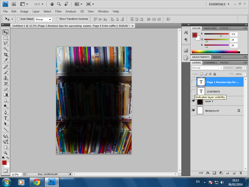
Construction of Contents Page

1) Like the front page, I adjusted the brightness and contrast on the this image, to make the colours pop more. I chose this image of the books, because I feel it relates well to schools and there is a variety of different types of books on the shelf, so it it incorporates everyone's tastes.
2) I then used the Rectangular Marquee tool, to create a dark rectangle where I would write the list of pages and their contents. I felt I needed this box, otherwise the text would be very difficult to read over the various colours of the books.


3) Next I added the masthead, using the same font as that of the front page. I chose white as the colour red was difficult to read against the background.

4) Lastly, I added the text, using the same font as the masthead for the page numbers. However as there was more text for the brief description of the page contents, I thought it would be more appropriate to write this standard Arial font, so that it wouldn't be difficult to read.


Sunday 10 November 2013

Constuction of Front Page


1) First I adjusted the contrast and brightness levels of the picture to make the colours more vibrant and alive.

2) Next I used the watercolour effect to make the picture look like a painting. As it is a school magazine, I wanted to impersonate maybe some art work done by a student. 


3) Lastly I added the text, I found I had to change the side of the text as it was quite difficult to read against the background of the books.

Friday 8 November 2013

Photos!

I chose this photo as I think the angle is different and interesting. My model, Angelina, is looking at the bookshelf in search of an interesting read. I chose the library setting as I thought it represented the idea of a school magazine perfectly, i.e. textbooks, revision guides etc. Also, featuring a 6th Former on the front cover is appropriate as they are they are my target market.


Again, taken in the library, I chose this shot as I thought it was also an interesting angle. My concept behind this shot was to make the reader feel as though they are browsing the shelves with Angelina too, which allows them to feel more connected to the magazine. As readers look to see which books are on the shelf, it will seem as though Angelina was right there and they are looking over her shoulder, which I thought was a fun concept.1


This photo was intended to be used for my contents page, it links in with my library themed front cover and I could edit the spines of some of the books to the names of the pages in the magazines which could be quite quirky. I could also just use this as a background and use a bright, bold text over it.


This shot captures Muna as she does her work, again she is a 6th Former so she is part of our target market, which will entice other people within our target market to purchase the magazine. I feel this photo is appropriate for my magazine as it shows Muna doing her work which is obviously school related.