
1) Like the front page, I adjusted the brightness and contrast on the this image, to make the colours pop more. I chose this image of the books, because I feel it relates well to schools and there is a variety of different types of books on the shelf, so it it incorporates everyone's tastes.
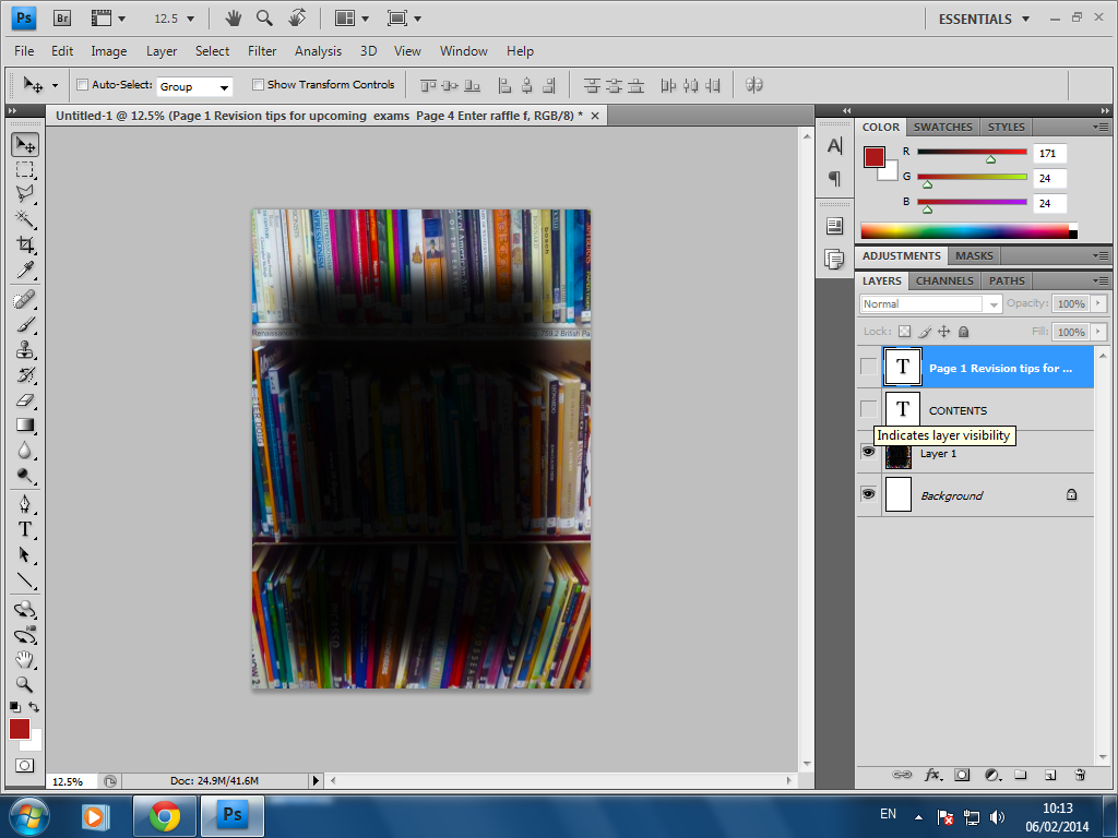 2) I then used the Rectangular Marquee tool, to create a dark rectangle where I would write the list of pages and their contents. I felt I needed this box, otherwise the text would be very difficult to read over the various colours of the books.


3) Next I added the masthead, using the same font as that of the front page. I chose white as the colour red was difficult to read against the background.
4) Lastly, I added the text, using the same font as the masthead for the page numbers. However as there was more text for the brief description of the page contents, I thought it would be more appropriate to write this standard Arial font, so that it wouldn't be difficult to read.
No comments:
Post a Comment