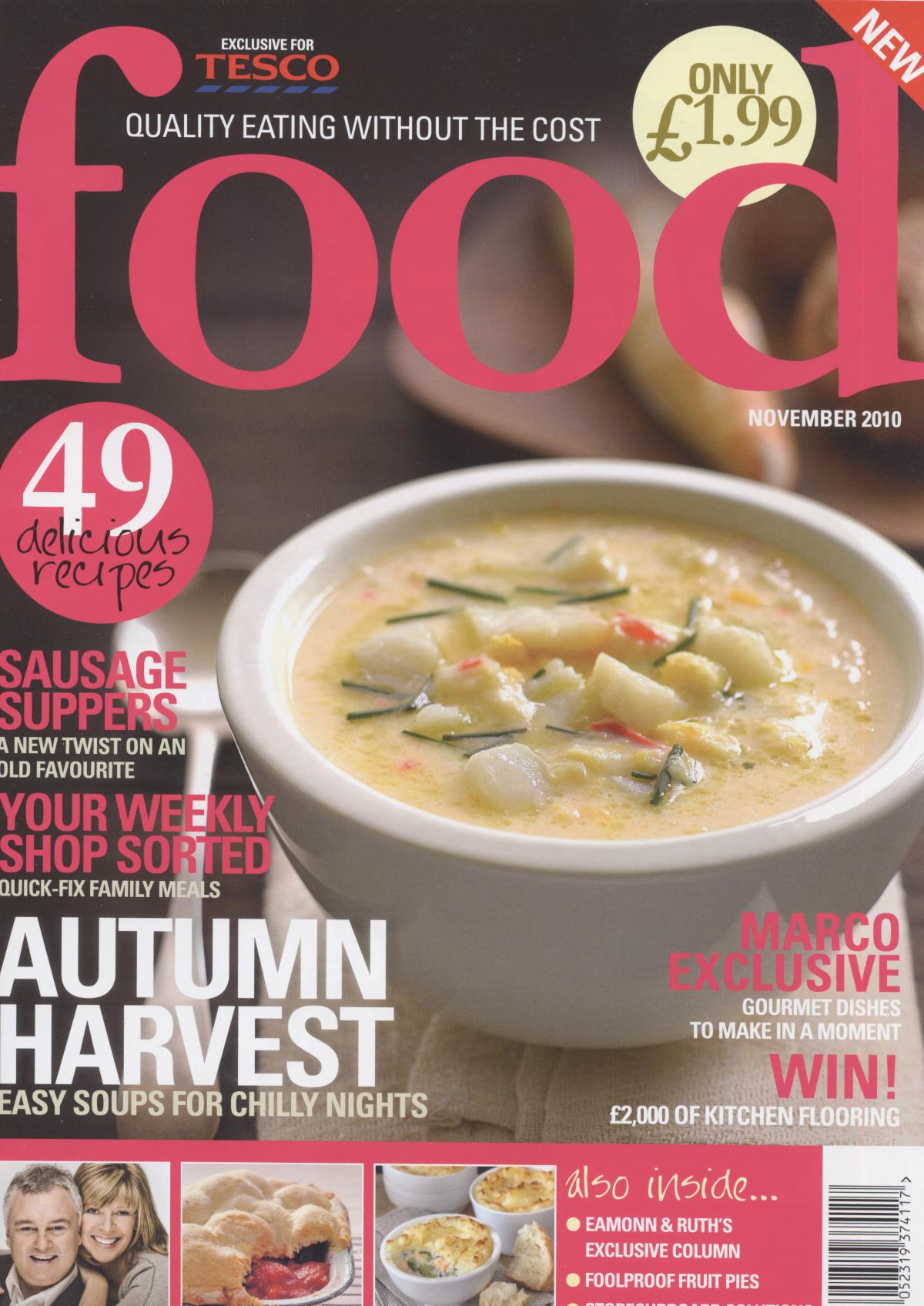
Pink suggests the magazine is aimed at women, and as the women are the ones most likely to be doing the weekly shopping, the heading "YOUR WEEKLY SHOPPING SORTED" supports this suggestion. The masthead is simple "Food" the reader knows what the magazine is about and the simplicity makes the magazine appear sophisticated so people will trust and be willing to use the recipe's and tips.
The image used is a bowl of warm soup, we can see the steam rising from the soup, which creates a feeling of warmth when viewed by potential buyers. The background is of a wooden counter top, probably in the kitchen, which is relevant for the magazine as this is where cooking will take place, so it almost subliminally makes the reader envision themselves making the bowl of soup in their own homes. By using deeps browns and warm colours, the magazine looks cosy, it makes people want to purchase it as it looks so inviting.
Words such as "WIN!" used in the bottom corner attract buyers as many people enjoy entering competitions and winning free prizes. The promise of a "Marco Exclusive" also encourages the readers to buy as they are getting information from a top chef.
No comments:
Post a Comment