Thursday 26 December 2013

Colour Testing

PURPLE
Purple, amongst other things, represents royalty. By using this colour on my magazine, readers will view this magazine and hopefully see a level of importance which will stand out from other magazines on the shelf. It is also a dark colour, meaning it will be easy to see against light and darker colours a well, which would be beneficial as the wardrobe for my models is all black.  Purple also shouts power and leadership, something that would subliminally attract potential readers to my magazine if they saw it on the shelf.

PINK
Pink is stereotypically a feminine colour, so as my magazine is aimed at both sexes I feel this colour will make males reluctant to purchase it. This colour font would be more suited to magazines whose main audience is female, such as “Top of the Pops” magazine for young girls.
GOLD
According to psychologists the colur gold represents success, achievement and triumph. As my main magazine article is centred around my fictional upcoming duo “CD”, I think this would be an appropriate colour as it represents the present and future selves. Gold is also a colour associated with royalty and R&B is a music genre that dates back very far and a genre that is still heavily represented in today’s music industry, so I feel gold is reflective of this. Richness can also be represented through the colour gold, so the idea that the magazine will be CD’s first big interview can be reflected through the use of gold.  If I were to use this colour, it would most likely be as an accent colour, as I think over using it would decrease it’s effect.

BLACK
This colour is associated with mystery and death, however it also connotes elegance. Black is also a colour that contrasts against any other colour, so choosing colours to accompany it will be easier. I want my magazine to have an element of sleekness to it so I think using black on my magazine will help this. I would use this colour for the text, such as the masthead, because it is a bold colour that would stand out against the page. As my artists CD are a new band there is also an air of mystery surrounding them which the colour black can reflect.

WHITE
The colour white often represents purity and innocence. I think this colour would be appropriate for my magazine and I would most likely use it for the front cover or double page spread. CD are 16/17 and they have just started their career so they are new to the music industry, the colour white would therefore be a good colour choice to represent their “innocence” and newness to the industry. In magazines the colour white gives an open and minimalistic, feel which allows the magazine appear to be more organized and clean cut.

BURGUNDY

Burgundy is a colour of class and sophistication, which is the look I am aiming for with my magazine. It is also a colour that favours both men and women, so it will not exclude any of my target market. I would use this font for the masthead and as an accent colour, like gold this is a colour I feel needs to be used in moderation in order to be appreciated. 

Saturday 14 December 2013

Font Testing

PULSE MAGAZINE
This is Arial which is bold and quite formal. From my research of R&B magazines, the font used is usually bold and big, so I feel this font would be appropriate for my magazine. I would most likely write the masthead in this font in bold, and then make it smaller for the rest of the text as it is also a clear and easy to read text.

PULSE MAGAZINE
The font above is Dragline BTN. This font looks like an imitation of a child’s handwriting and would most likely be found on a children’s magazine or a magazine aimed at that target audience. It would be inappropriate for my R&B magazine as my target audience are much older, so it would be very out of place. Also it does not fit the connotations of R&B music being strong, smooth and soulful.

PULSE MAGAZINE
The third font is Curlz MT. Again this font would be unsuitable for my magazine as it is too cursive and therefore will be viewed as more feminine. This font would be better suited for a girl’s magazine, for example a ballet subscription magazine or princess magazine. As my target audience are both males and females, this font would alienate the male readers and make them feel as though this magazine is not aimed at their gender.

PULSE MAGAZINE
The next font is Mr Big SF. The characters themselves are very large and the curved edges add a playful feel to the font which I don’t think matches the feel of an R&B magazine. The chubby font, appears like it would be more suited again to a magazine whose main target audience was younger. 


PULSE MAGAZINE
This font is Diamond Heavy. I think this font is appropriate for my magazine, as like the first font I tested it is bold which is conventional of an R&B magazine. The characters are also spaced out, so if I were to blow it up and spread it across the top of my magazine, it would fill the space well. The edges are also sharp and smooth, reflective of the sleekness of an R&B magazine.

(upper case) PULSE MAGAZINE  (lower case) Pulse Magazine


The last font I will be testing is called Kunstler Script. This font is extremely hard to read when the characters are all written in upper case and in lower case, the font is still difficult to read as well. On a shelf this font definitely would not stand out and it is very unconventional of an R&B magazine to feature a very cursive font. Also for my magazine, I am sure I want all the characters to be written in upper case, as capital letters give the effect of shouting and capturing attention which is what I am aiming for when I create my magazine. 

Friday 13 December 2013

Reader Profile

PULSE magazine readers are a group who prefer to support upcoming, lesser known artists as opposed to big artists who have already made it in the industry.They see it as way to discover new music, which benefits the artists, because their music is more widespread and themselves, because they are widening their music tastes. My magazine readers, range from 15 - 25, so they are expecting to see a magazine that is sophisticated. My readers feel the magazine should be on the cheaper side. This is understandable as they are young, so obviously do not have as much money.  

Focus Group Responses Analysis

1) Would you like to see upcoming artists in the magazine?

Our focus group all decided quite quickly that they would like to see upcoming artists featured in the magazine. They also added they would want these artists to be artists that the magazine itself had discovered, perhaps through a competition or so. when we asked them why, they responded that it "would be interesting" and it would give them a good opportunity to discover and support new talent as well as reading about artists that already receive a vast amount of coverage already.

2) What main colours wold you like to see throughout the magazine?

The group associated R&B music as being quite chilled and relaxed and therefore said they would want colours that reflected this such as cream. They also described R&B music as rich, therefore colours such as gold, silver and other metallic colours would reflect this. 

3) Would you like a lot of images on the front cover?

There was not much hesitation when the group decided against a large amount of pictures. It was said that it would be "too much clutter" and would resort in the magazine looking "tacky" as the majority of magazines that are heavily loaded with lots of images are celebrity gossip magazine or tween magazines like Top of the Pops. Another point made is that the use of too many pictures would distract from the main picture or eye-catching headlines. This then lead onto the question of what kind of pictures they would see as appropriate for the magazine. The general response was there should be one main image that was either of a person who would be featured in the magazine or something related to them, for example a microphone. 

4) What would you like the double page spread (DPS) to feature?

The interviewees thought the DPS should definitely feature more information on the artist or main picture on the front cover. This could be in the form of an interview, a short background story e.t.c.

5) How much would you be willing to spend on the magazine and why?

Our focus group said they would be willing to pay between 60p - £1.20. When we prompted them as to why they said it would actually depend upon a variety of factors, such as the size of the magazine, if the magazine was full and quite large, they would be willing to pay a little bit more to compensate this. Also, they would also be willing to pay more if the magazine included a free gift, as they realize this would cost the magazine more to produce. The quality of the content within the magazine was also a deciding factor. For example, if the magazine was filled with interesting, well written articles, they would feel happier paying more for it. The magazines reputation was also an important element. As  this magazine is new, they would not be happy paying too much, but overtime as it's reputation amongst other leading R&B magazines improved they would be more willing to pay more for the magazine.

6) What kind of font would you expect to see on the front of an R&B magazine?

The group agreed that they would expect to see big, bold text on the front of the magazine. They also added it should be in a dark font, preferably black or any other sophisticated colour.

7) What content do you look for in a music magazine? 

The group felt that they content they expected and liked to see in a music magazine was information on gigs and concerts of bands/artists, they added that these would be effective on a separate page nearer the back or as an advertisement on one of the pages. Exclusive information on artists and bands was also a feature the group looked for in a magazine. a standard editor's note was also a must and interviews were very key, as they allow the reader to get closer to the artist and learn more about them. 

8) What is your favourite music magazine and why?

We asked this question because if we knew what type of magazine they favoured we could explore this magazine and see what it was exactly that drew them to it, and use this knowledge as inspiration for my own magazine. 

Our group chose Kerrang as it had "had very interesting information". When we asked them to expand, they explained it was the language style of the magazine that drew them to it and brought the articles they were writing about to life. 

9) Would you want a lot of advertisements in the magazine? 

The group responded that the amount of ads in the magazine is based on their relevance. For example, if they are related to a specific article or they are to do with the magazine, then they are fine and even welcomed. But if they appear random, or tacky, like a fruity perfume ad in a heavy rock magazine, then they are seen as very annoying and this may affect whether the reader will purchase the magazine again. 

10) What else would you feature in the magazine? 

This question was to see if the group had anything more to say, but they felt that they had said everything in the responses to the previous questions, however, they did add that quizzes could be quite fun to include in the magazine?

11) How often would you like the magazine to be released?

The final question was in response to how often the magazine ought to be released. The group agreed that monthly would be best, as they felt that a lot could happen in a month, therefore the magazine would have plenty of content to write about. Also, they felt that the magazines that are released monthly, often has the highest quality content, as they have had a long time to produce it, and weekly magazines sometimes felt rushed and sometimes content is repeated to fill up space, making the magazine feel "tacky".


Friday 6 December 2013

Focus Group Questions

In order to collect opinions and generate a feel of people's views towards my potential magazine, we organized a focus group and discussed and expanded upon the original answers. As the questions were open, we were able to obtain more personal responses and we could use their answers to open a new topic which was very effective. These are the questions I asked:

1) Would you like to see up and coming artists in the magazine?

2) What main colours would you like to see being used throughout the magazine

3) Would you like a lot of images on the front cover?

4) What would you like the double page spread to feature?

5) How much would you be willing to spend on the magazine and why?

6) What kind of font would you expect to see on the front of an R&B magazine?

7) What content do you look for in a music magazine?

8) What is your favourite music magazine and why?

9) Would you want a lot of advertisements in the magazine? 

10) What else would you feature in the magazine?

11) How often would you want the magazine to be released?

Thursday 5 December 2013

R&B Magazine Contents Page Analysis


VIBE Contents Page Analysis 1


This contents page is taken from the VIBE issue featuring Usher on the front cover. The masthead reads "Featured" as opposed to "Contents" and the different articles are listed in a column format on one side. When looking at this contents page, we can clearly it is from the same magazine, which is very important, as a lack of correlation between the front cover and the rest of the magazine can lower the standard of the magazine. 

On this page we see Usher stood in a strong, legs apart stance. He is wearing the same aviator glasses seen on the front cover, showing a link between the two. Although he is wearing a different outfit, he is carrying a travel bag and on the front cover he was dressed as a pilot, so this change to casual clothing might suggest he has landed and ready to shake the music industry metaphorically. 

He is standing against a gradient grey wall which matches the grey tones of the front cover. The text of the contents page is written in white, so it is clear for the readers to read it against the background and the page number is written in black, so it doesn't blend in with the rest of the text. 

This contents page is very plain aside from the text and the photo of Usher, this is something I will bear in mind when I produce my own magazine. 


VIBE Contents Page Analysis 2


This contents page is from another issue of VIBE that featured Ciara on the front cover. The masthead is very large and is broken up onto 3 lines which makes it more visually appealing to readers. 

As R&B is quite a sexual genre of music, Ciara is wearing a leotard which clings to her form and highlights her curves, this is to entice the male readers of the magazine. She is also wearing heels, which make her legs appear even longer, again to draw in readers. the position of her body in an almost "L" shape has been strategically used as a means to frame the list of contents. Near her feet an outline of the "V" from VIBE can be seen, this reiterates that this contents page is from the same magazine and therefore creates a clear pattern throughout the magazine. 

The background is plain, this is to allow the reader to clearly navigate and read the text. The list of contents itself is split into "Features" and "Fashion" and these words are written in a different font to the rest of the texts so that they stand out and readers who are interested in the Fashion section can find this easily and vice versa. Altogether there are about 5 page numbers written, it is not loaded with the page number and explanations of every single article in the magazine, only key ones. This may be so the magazine can ensure readers are actually reading the magazine as opposed to only flicking to the sections that interest them. 

Friday 22 November 2013

R&B Music Magazine Analysis'

VIBE MAGAZINE ANALYSIS

The word vibe, in addition to being the abbreviated form of vibration, is also used to describe "a distinctive but intangible quality surrounding a person or thing". By the use of this word, we know straightaway that this a music magazine. The use of this word as the title of the magazine almost serves as a description for each artist featured on the front cover each month. It may also refer to the "intangible quality" of the magazine itself, how it provides the best quality content amongst it's competitors. 

Various shades of blue and yellow are used as the main colours of the magazine, these colours are complimentary colours on the colour wheel, so they are a good combination and they allow the reader to clearly see the writing against the background. The colour blue also, represents relaxation, which links nicely to the title and connotations of the word "vibe". The most interesting, words and headlines appear to be written in yellow, for example, the title of the magazine "Vibe" and the word "Ciara" is also important as she is model for the front cover of this issue.  

Featured on the front cover is Ciara, a famous RnB music artist and dancer. She is wearing a tight fitting, leather look dress which accentuates her curves. The headline "New Music New body" suggests she has reinvented herself and the dress is tight to showcase her new body. Ciara's facial expression is dark and her makeup is also and smokey which creates and atmosphere of mystery, which would encourage the readers to purchase the magazine to find out what the magazine has to offer. Her sexy look on the magazine would mainly attract men to this particular issue and the rhetorical question "Don't You wish Your Girlfriend Was Hot Like Me?" reiterates that this issue is aimed at men. As the main target audience is men, the heavy use of blue can be explained, as stereotypically, blue is considered a male colour. 

Direct addressing is used to make the reader feel a part of the magazine, "Don't You", when reading this, we can feel the emphasis on "you" and the reader feels as though the magazine is including them in the magazine, which will encourage them to buy it. 


BLUES&SOUL MAGAZINE ANALYSIS


The simplicity of the title, is very effective for this magazine, a reader selecting a magazine will instantly know it is about the music genre 'BLUES&SOUL" and can then make a quick decision as to whether they would like to purchase it or not. For the magazine and it's business, this is beneficial as they know many people enjoy the "I am what it says on the tin" marketing strategy. In it's abbreviated form, however, the name could also be misinterpreted as a popular swear word, RnB is known for frequent use of swearing, so this could be a deibrate use in order for the magazine to play up to the stereotype given to this genre of music. 

The title is written in white against a red rectangle. Red, may represent the passion the magazine has for blues and soul music, in the headline the word "fire" is also written in red, the magazine may do this to subliminally encourage the reader to make a connection between heat, fire, and power and the ethos the magazine is attempting to send out. The white used for the title, may again be used to reinforce the idea of the simplicity and pureness of the magazine's content. 

World renowned Sean Paul, is the cover model on this issue. His attire is very urban, which is suitable for the magazine as it is obviously an RnB magazine and historically this genre is very urban in it's roots. He is also wearing a lot of jewellry, stereotypical of RnB artists. The photo appears to have been enhanced with a vintage style concept, this may be to reflect Sean Paul's importance within the industry and particular genre. At 40, he is at the top of his game and well respected in music, therefore I feel the use of the vintage filter is very effective in conveying this. He is stood against a grey wall and his hands are clenched, in a way typical of rappers preparing to begin performing or it may suggest that, along with his head slightly cocked to the side, that is pensively thinking about something. Whichever it is, it excites the reader to purchase the magazine and find out more inside.

Another aspect of himself that Sean Paul is known for, is his mohican hair which he has been rocking for a considerable amount of time and has now become a staple of his. By highlighting him as "The Last Of The Mohicans" the magazine is adding humour to the magazine by suggesting they have exclusive content as Sean Paul aka the "Last Of The Mohicans" is featured in their magazine. 

In regards to the rest of the magazine, it is quite bare. With only a list of interviewees and "Sean Paul" written large at the bottom, there is not much else. This again, is in response to the magazine of "less is more" and is a contrast to other magazines that pack on as much as possible in order to attract readers. The fact that there is liitle on the front cover, leaves readers curious to find out what is inside and also coincides with the saying "quality not quantity". 


Various Music Genre Front Cover Analysis'

 TOP of the POPS Magazine Analysis (Pop Genre)

Top of the Pops is a music magazine all about pop music, the type of music found in the Top 40 Charts, which is reflected by the title, so it focuses on artists and music that is currently topping the charts. 
The main colour that can be seen on the magazine is pink, which suggests that the magazine is aimed at young girls, as stereotypically in media, pink is a colour associated with females.  Baby blue is also a prominent colour, this colour also tends to be associated with girls, with the darker tones of blue reserved for males. Yellow, evokes emotions of happiness and the magazine's choice of using this colour on the magazine may be a way of subliminally making the reader feel happy as they read it.  

Featured on the front of the magazine are X Factor's boy groups Union J and District 3. As this magazine is aimed at the "tween" girls, they are highly appropriate as girls this age are often infatuated with good looking boys in groups, proved by the overwhelming success of One Direction, JLS and older groups such as N Sync and Take That. The boys are stood back to back to correspond with the headline "Battle of the Fittest" which is a pun that refers to their rivalry in the X Factor, but also in terms of their looks, as "fit" is also a slang term mainly used by teens to describe an attractive person. With big hair swept to the side and wearing stereotypical teenage attire i.e. hoodies, both boys are projecting a good boy, well groomed image that many tween girls fawn over.  

Surrounding the main photo , are several other artists known for their popular tracks. At the top, teen heartthrob, Justin Bieber can be seen, as his fan base consists mainly of tween girls, his picture on the cover will attract the same girls that the magazine hopes to also lure. One Direction, Little Mix and Girls Aloud, are all also featured on the front cover with captions next to each, promising juicy gossip. Although this is music magazine, it also offers fashion advice. The preview of items seen at the top, are again to draw in the attention of the target audience i.e. baby pink lipgloss and printed jumpers, as these are fashion items they normally wear.

Speech bubbles coming from the celebrities mouths are also used, they feature captions that address the reader directly and make it appear as though the celebrity is talking to them, this technique is effective as it makes the reader feel a part of the magazine. The speech bubbles also imitate text messages or internet chat messaging, tween girls would appreciate this as it is something they spend a lot of time doing. 

 Classic Rock Magazine Analysis (Rock Genre)
 
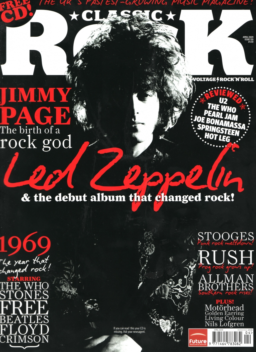
Classic Rock is a magazine dedicated to early rock music, which  the magazine felt was in danger of being forgotten as mainstream rock magazines like Q and NME focused on modern/upcoming rock music. The title is very simple, and the reader knows straightaway that the magazine is about classic rock music.

Black is used for the entire background of the magazine, in the rock genre black is known worldwide as a colour associated with it, so it is appropriate for this magazine. Red is also a colour associated with rock music,  red symbolizes passion, which could be the magazine showing it's passion to classic rock music.

On the cover is Jimmy Page from the band Led Zeppelin who are considered rock legends. The image is black and white, which may be to represent how old the band are and how prestigious their are in their genre. "Led Zeppelin" is also scrawled across the front of the magazine, in a signature style, this makes it appear as though Led Zeppelin themselves have signed the magazine, so readers will feel as though they are purchasing something special when they buy it. The magazine also offers a free CD inside, which will make readers feel as though they getting more out of their money when they purchase it. 

VIBE Magazine Analysis (R&B Genre) 

Vibe is a popular R&B/HipHop magazine that ran it's first issue in 1993. The layout is often the same, with the celebrity on the front, usually covering a part of the magazine title, this technique shows the importance of the magazine and how it is so well known and recognized, that it can afford to have the name partly covered, as everyone will know what magazine it is. 

The colour scheme is red/white/black which is seems to be a colour scheme that is favoured in the magazine industry as seen in the "Classic Rock" magazine above. The caption next to Eminem's head explains how he "literally almost died" so the red theme may represent the blood shed when a person dies. "The Roots" is also written in red, although they are a soul band, the way the name is presented in this magazine implies that "roots" are underground which is normally where people are buried so it could be in reference to Eminem almost dying. Names of drugs, beginning with V are written in the "V" in Vibe, this is alliteration and looks effective on the page as it looks as though they are shadows of the "V" in Vibe. 

Stood arms crossed and straight faced is Eminem, wearing a black tank top, he fits in with the colour scheme and his black tattoos also fit in. His facial expression, is somber and serious which is appropriate as it correlates positively with the caption around him, which is a serious topic. The stance in which he is stood, makes him appear as though is ready to confront something or somebody and exudes confidence, the fact that he is now clean shows that Eminem has beat his demons and can now take on anything. We can see his most well known tattoo of his daughter Hallie as he folds his arms and among all the seriousness of the cover, it stands as a reminder of the most important person of his life and the person he probably wanted to come off drugs for. 

The background of the magazine is a plain grey/white colour, which contrasts against the black of Eminem's tank top to make him stand out more and make him the main focus of the magazine.

In the bottom corner, the question "Who is the best rapper ever?" is posed to the reader, for hardcore rap fans, this question is one that often sparks major debate within the various fan bases, so readers will be intrigued to see whom the magazines rates the "best rapper". Around the image of Eminem, various other well known rappers are also mentioned showing that the magazine has a lot of content to offer so readers will purchase it. On the opposite side of the page another controversial questioned is posed asking whether "The Roots are too black for Jimmy Fallon?" Jimmy Fallon is a very well known talk show host who regularly has A listers on his show, so this question will interest many readers to purchase the magazine to find out the full story. 

Primarily, I think this magazine is aimed at men, the colour scheme suggests this and rap is mainly dominated by men, with a few women such as Nicki Minaj and Lil Kim involved, which also leads me to believe this issue is aimed at males.


Monday 11 November 2013

Construction of Contents Page

1) Like the front page, I adjusted the brightness and contrast on the this image, to make the colours pop more. I chose this image of the books, because I feel it relates well to schools and there is a variety of different types of books on the shelf, so it it incorporates everyone's tastes.
2) I then used the Rectangular Marquee tool, to create a dark rectangle where I would write the list of pages and their contents. I felt I needed this box, otherwise the text would be very difficult to read over the various colours of the books.


3) Next I added the masthead, using the same font as that of the front page. I chose white as the colour red was difficult to read against the background.

4) Lastly, I added the text, using the same font as the masthead for the page numbers. However as there was more text for the brief description of the page contents, I thought it would be more appropriate to write this standard Arial font, so that it wouldn't be difficult to read.


Sunday 10 November 2013

Constuction of Front Page


1) First I adjusted the contrast and brightness levels of the picture to make the colours more vibrant and alive.

2) Next I used the watercolour effect to make the picture look like a painting. As it is a school magazine, I wanted to impersonate maybe some art work done by a student. 


3) Lastly I added the text, I found I had to change the side of the text as it was quite difficult to read against the background of the books.

Friday 8 November 2013

Photos!

I chose this photo as I think the angle is different and interesting. My model, Angelina, is looking at the bookshelf in search of an interesting read. I chose the library setting as I thought it represented the idea of a school magazine perfectly, i.e. textbooks, revision guides etc. Also, featuring a 6th Former on the front cover is appropriate as they are they are my target market.


Again, taken in the library, I chose this shot as I thought it was also an interesting angle. My concept behind this shot was to make the reader feel as though they are browsing the shelves with Angelina too, which allows them to feel more connected to the magazine. As readers look to see which books are on the shelf, it will seem as though Angelina was right there and they are looking over her shoulder, which I thought was a fun concept.1


This photo was intended to be used for my contents page, it links in with my library themed front cover and I could edit the spines of some of the books to the names of the pages in the magazines which could be quite quirky. I could also just use this as a background and use a bright, bold text over it.


This shot captures Muna as she does her work, again she is a 6th Former so she is part of our target market, which will entice other people within our target market to purchase the magazine. I feel this photo is appropriate for my magazine as it shows Muna doing her work which is obviously school related.

Friday 25 October 2013

Font Testing


1) I think Times New Roman, would not be suitable for a magazine as it is very plain, quite boring and not a font that would attract our target market to purchase the magazine. This font would be better suited to perhaps a newspaper such as The Daily Mail or Sunday Times, as they deliver national news, which is sometimes of a serious nature, therefore a more formal font is required in order for them to look professional.

2) Jokerman is a font I believe would be better suited, if our magazine was aimed at younger children about 10 and below, as it is very squiggly and playful, which would be appealing to younger children. I feel our target audience would find this font childish and immature and would struggle to take the magazine seriously.

3) I feel Mr Big SF could be suitable for my magazine, the font is quirky without being too childish at the same time. I would most likely use this font for the masthead, as writing too much in this font would be difficult to read and the appeal would be lost.

4) Arial Black, would be suitable for my magazine as it is bold and will stand out against any background. The colour is also neutral so it is not favouring males or females. This font would be used for more formal style magazines or magazines wanting a cleaner finish. 

5) This font would not be suitable for my magazine as it is very elaborate and quite feminine. A font like this would be better suited on a women's magazine where the audience would be predominantly female. Pink is also a colour mainly associated with females, so male students hoping to purchase the magazine may feel put off by this. 

6) Undercurrent BNT font could be quite fun to have on the cover, it's graffiti style is quite urban and graffiti is also stereotypically associated with teens, which is who my target audience are. A font style like this, would most likely be found on an underground music magazine and any other magazines with a more urban theme to them.

Thursday 24 October 2013

Colour Testing

Red symbolizes excitement, energy, passion, love, desire, speed, strength, power, heat, aggression, danger, fire, blood, war and violence. As red is the colour of the school logo and this is a school magazine, i think red would be an appropriate color for my magazine. Red is also an attention grabbing colour so it would be attract people's eyes to it. 

Orange, is associated with warmth and happiness and is also a colour that represents energy. As orange is a warm colour, I feel it would draw readers to the magazine and it is also a colour that makes people feel happy, so this may help make them feel more inclined to read it. 

Yellow is a colour that represents happiness, it is a bright colour that will easily attract people's eyes towards it, however I would use it cautiously as too much of this colour, apparently causes irritation, which contradicts what I am trying to achieve.

Green has connotations of youth, growth and calmness. As my target market are young people that are growing, I feel this colour would subconsciously draw them to the magazine. Green also reflects calmness, which would be good as readers would feel calm as they flicked through the magazine.

Blue represents relaxation. It is also used worldwide as a "boy" colour, so I feel that maybe using blue might make females feel as though the magazine is not aimed at them. I would use this colour for maybe headings and some text, but not for the majority of the magazine.

Purple is a rich colour that oozes luxury and is also considered a royal colour as well. Using this colour would make my magazine feel more expensive than it is, so readers would feel like they are getting more out of their money which would be good.


Thursday 10 October 2013

School Magazine Questionnaire: Results Analysis


In this post, I will be be analyzing some of the results from my questionnaire and discussing how they will help me in regards to creating my school magazine. Here is the first analysis:

Q1
The bar graph above, shows that over half of the total people questioned would be reluctant to pay for a magazine, indicating that it would be sensible to either make the magazine free, or sell it for a small fee. 

Q2
 Over 90% of the people, said they would prefer the magazine to have an informal theme to it (yes, I've noticed the typo in the question!). In response to this, I will be sure to construct my magazine in a way that reflects this response.

Q3
This chart shows me that the majority of people feel that fashion would be the topic they would find the most interesting, followed by career/educational events. I do feel the response to this question is biased as the majority of people I asked to complete my questionnaire were girls, so fashion having the highest percentage is reflective of this. However in my magazine, I  will be sure to include a lot of the top 3 topics.


Q4
Over 80% of people said they would prefer the magazine to be bright and colourful. Therefore when making my magazine I will make sure to use cool, bright colours as opposed to formal, dull colours such as grey and other darker colours.

Q5
This information tells me that just over half the people would want the magazine to be available monthly (again, I've noticed the typo!). 33% want it weekly, so perhaps to compromise, it could be available fortnightly. Only 14% chose termly, so I will definitely not bring the magazine out termly.


Q6
The majority feel that tutor would be the best place for them to get the magazine. Seeing as they attend tutor regularly, this would be the easiest place for their tutor to just hand it out, as opposed to visiting a magazine stand, which they would have to do in their own time, which may affect their willingness to purchase the magazine. Therefore, I will make the magazine available to purchase through tutor.

Q7
Over 85% wanted an average amount of pages in the magazine, therefore i would make sure to make the magazine isn't too long or too short.

Q8
 I found that more people would be willing to purchase the magazine if it included a free promotional gift. When producing the magazine, we would be sure to include a gift in order to entice people to purchase the magazine.


These results show that people would prefer more informal fonts as this would create a more interesting, casual magazine that is easy to read.


People did not have much to say in this last question, the majority of the answers were in regards to my spelling mistakes.